This image comes from thinking about inductive visualization (but is basically just a stacked bar graph) and visualizes the area grade and predicted trend of desirability over then next ten to fifteen years organized by percent of land unoccupied. It points to both the relative density of low-income and Black neighborhoods compared to white and middle- and upper-class neighborhoods at the time as well as the relationship between land available for development and speculative grading. This could be thickened by annotating any “terrain” descriptions that point to aversion to develop an area (i.e. a flood area). I’m particularly interested in speculation and its naturalization of financial decisions by state and corporate institutions and the question of “surplus land” and this visualization helps put those elements in conversation.
This image shows border lines between D-grade areas and neighboring graded areas. Could be improved by adding in built environment edge conditions–i.e. railroads, parks, bodies of water. The single instance of red-green border is an area with a “description of terrain” that reads “High grade negro- more land around houses- good transportation” and the only “favorable influence” is “obsolescence.” This specific area description offers a fairly fairly heavy-handed description of organized abandonment, and I will be investigating the area more closely both on-site and archivally.
This image depicts only instances of differing grades bordering. Edges are interfaces, so this visualization method might help illustrate something for further consideration. So far, I’m thinking about the buffer purpose of “yellow” areas– especially as it is illustrated in abnormal geometries such as the breaking of area D4 into four pieces with very thin yellow buffers between it and blue B5. I’d like to “uncoil” the borders into a simple line comparing the length of each border type.
A development on the flag piece that responds to the Flag Code’s insistence that “The flag should never be displayed with the union down, except as a signal of dire distress in instances of extreme danger to life or property.”

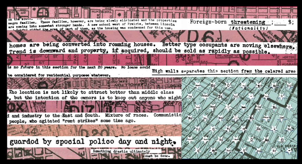
During the course of our project, I plan on continuing to do close, slow readings of area descriptions and explore alt. presentations of the maps and descriptions. I will also develop an outline for a research design responding to some of the relationships arising out of the process. More to come, but wanted to share some visual experimentation from the past week.

Leave a Reply

Your email address will not be published. Required fields are marked *